This week's thumbnail trend: bigger subjects, fewer words
A weekly breakdown of three CTR-focused thumbnail styles from recent YouTube hits: cinematic scale, evidence-collage explainers, and face-led mood thumbnails.

This week's strongest thumbnails were not trying to explain everything. They sold one fast read: scale, evidence, or a face you already care about.
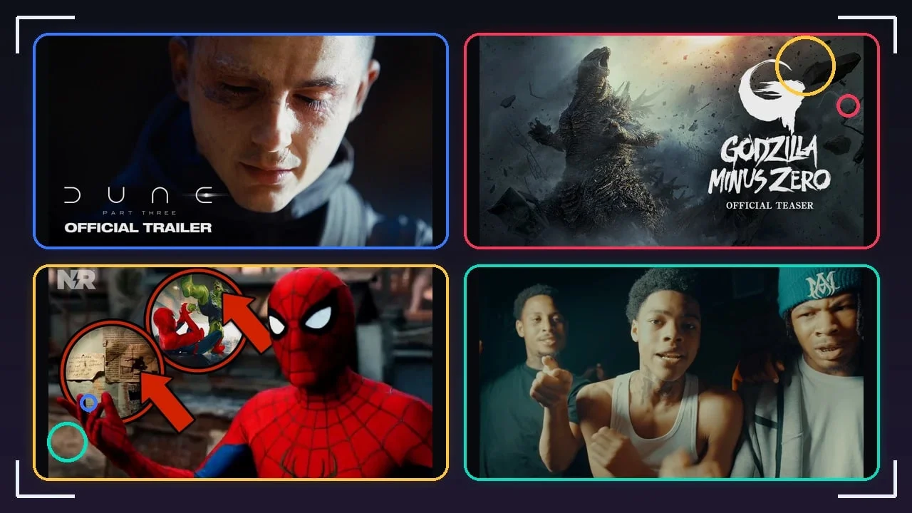
The highest-performing examples in the sample pushed that read hard. Dune: Part Three used a tight, low-lit face crop with the words "Official Trailer" as the only blunt promise, while passing 12.3 million views. 1 GODZILLA MINUS ZERO went the other way: a massive monster on the left, flying debris, and a white logo block on the right. 2 Gaming thumbnails leaned louder, with My Best Meccha Chameleon Strategy Yet using a readable in-scene joke, and Palworld 1.0 packing the frame with saturated characters and weapon action. 3 4
For designers, the useful pattern is simple: the copy is getting shorter, but the visual promise is getting more explicit. If the thumbnail has no text, the face or character must carry the click. If the thumbnail has text, it is usually a label, a proof cue, or a single curiosity phrase.
Weekly visual trend summary
Three CTR patterns stood out this week:
| Trend | Visual read | Copy behavior | Best fit |
|---|---|---|---|
| Cinematic scale | Huge IP subject, dark atmosphere, one dominant logo zone | Trailer labels and franchise names do most of the work | Film, game launches, event-style reveals |
| Evidence collage | Face or character plus circles, arrows, split screens, platform marks | Very short proof cues, often one badge or number | Commentary, breakdowns, gaming reactions |
| Face-led mood | One close subject, direct gaze or tense action, little or no overlay text | The title carries the literal topic; the thumbnail sells emotion | Music, creator-led videos, personality content |
Top 3 thumbnail styles
1. Cinematic scale with almost no explanation
The visual style description
This style uses a movie-poster read, not a normal YouTube explainer read. The frame is dark, smoky, and contrast-heavy. The main subject is oversized: a face fills the right side in Dune: Part Three, while Godzilla occupies the left half of the frame in a storm of debris. 1 2
The important detail is restraint. There are no extra arrows, no shocked face cutout, and no explanatory sentence. The thumbnail trusts scale, lighting, and brand recognition to make the viewer stop.
Key text copy used
- "Official Trailer"
- "Official Teaser"
- Franchise logo text, used as the main readable anchor
Why it drives clicks
The click promise is immediate: this is the official, large-scale version of a story viewers already know. The words mainly remove doubt. "Official Trailer" tells viewers they are not clicking a fan edit or commentary clip.
The design also works at small size because the subject silhouette is readable before the text is. A giant monster, a bald face in hard side light, or a bright logo block can survive the feed compression that kills more detailed layouts.
How to apply it
- Pick one hero subject and make it occupy at least one third of the frame.
- Use atmosphere as contrast: smoke, dust, backlight, rain, darkness, or a blown-out light source.
- Keep copy to a trust label: "Official," "Trailer," "Teaser," "Launch," or the IP name.
- Place the logo or copy in the cleanest negative space, not on top of the face or creature.
- Avoid adding reaction faces unless the video is commentary rather than the source event.
2. Evidence collage for breakdowns and gaming reactions
The visual style description
This style is the opposite of cinematic restraint. It points. The New Rockstars Spider-Man thumbnail puts Spider-Man large on the right, then uses red circles and arrows to isolate two pieces of evidence on the left. 5 The BLACK OPS and BLACK OPS 2 on PS5 feels surreal thumbnail uses a creator face on the left, a split-screen game comparison, the PS5 logo, and a small "+100" cue. 6
Gaming comedy used a related version. My Best Meccha Chameleon Strategy Yet has a white character with the hand-written phrase "THAT AIN'T ME" on its back, facing a taller yellow character with an angry expression. 3 The whole joke is legible before the title is read.
Key text copy used
- "THAT AIN'T ME"
- "+100"
- Platform or brand marks such as the PS5 logo
- Arrows and circles acting as visual copy, even when they are not words
Why it drives clicks
The collage tells the viewer there is something specific to inspect. The arrows and circles create a small information gap: "What did I miss?" The creator face or recognizable character adds social proof. Someone is reacting, pointing, or discovering on the viewer's behalf.
This format is especially strong when the video promises a breakdown, Easter egg, patch reaction, challenge run, or surprising mechanic. It gives the feed a visible reason to believe the title.
How to apply it
- Use one large face or character as the emotional anchor.
- Limit annotation to one or two evidence targets. More than two starts to look like clutter.
- Make arrows thick and high-contrast. Red still works because it reads instantly against game and movie imagery.
- Treat small text as an object, not a sentence. One phrase such as "THAT AIN'T ME" is enough.
- Put the most important evidence target near the center third so it is not lost under the timestamp area.
3. Face-led mood thumbnails with title doing the copy work
The visual style description
Music and personality videos often removed thumbnail text entirely. The YEONJUN Ice Cream thumbnail uses a large face close to the right edge, a warm wood-paneled room, and a smaller dancer in the background. The only readable brand element is the music label mark. 7 FullyChop - Vultures uses three performers close to the camera in a dark scene, with the center figure and right-side expression carrying the energy. 8
The style also appears in creator-led gaming. CaseOh's Animal Hospital... places the creator face large at bottom left, outlined like a sticker, with the game character centered in a clean lobby environment. 9 The face says "reaction" faster than a written label could.
Key text copy used
- Often none inside the thumbnail
- Label or channel marks only
- The video title carries the literal hook, such as "Ice Cream," "Vultures," or "Animal Hospital..."
Why it drives clicks
This style bets on recognition and mood. A close face, direct gaze, open mouth, squint, or tense body position gives the viewer a social cue before they read. The lack of overlay copy also makes the frame feel more premium, especially for music videos and official releases.
It works when the subject has audience pull. If the viewer knows the artist, creator, or character, the clean crop can outperform a crowded text design. If the subject is unknown, the same approach may look too quiet.
How to apply it
- Crop the face or body language large enough to read at phone size.
- Keep the background simple, but let it set mood: warm room, dark street, bright game lobby, stage light.
- Use a clean face outline or edge separation when the subject competes with the background.
- Do not add text just to fill space. If the title already carries the concept, let the thumbnail sell emotion.
- Use this style only when the person, artist, avatar, or character is the main reason to click.
Practical takeaways for next week's thumbnails
If you are designing for CTR, decide which job the thumbnail must do before opening the design file:
- Prove scale: Use one giant subject and minimal copy.
- Prove there is evidence: Use arrows, circles, and one readable clue.
- Prove emotion: Use a close face or character posture and let the title handle the literal words.
The biggest mistake is mixing all three jobs in one frame. A cinematic reveal with arrows feels cheap. A commentary collage without a clear evidence target feels noisy. A face-led music thumbnail with too much text loses the mood that made the face worth using.
References
- 1Dune: Part Three | Official Trailer
- 2GODZILLA MINUS ZERO | Official Teaser
- 3My Best Meccha Chameleon Strategy Yet
- 4Palworld 1.0 Official Launch Trailer
- 5SPIDER-MAN BRAND NEW DAY New Trailer Easter Eggs + Concept Art Details!
- 6BLACK OPS and BLACK OPS 2 on PS5 feels surreal
- 7YEONJUN 'Ice Cream' Official MV
- 8FullyChop - Vultures (Official Music Video)
- 9Animal Hospital...
Related content
- Sign in to comment.